
The power of a convincing story often goes overlooked in the scientific community. While most researchers opt to display their findings in flashy publications or high impact journals, others are taking a less traditional but conceivably more impactful approach at communicating their findings.
Story maps are a simple yet elegant way for scientists to literally ‘map out’ research results. Gail Chmura, a professor in the Department of Geography and a specialist in biogeography and paleoecology, has done just that. Last week, Chmura and colleagues published two interactive story maps on the McGill Geographic Information Systems (GIS) website about the endangered Maritime Ringlet butterfly and carbon stores in the Bay of Fundy.
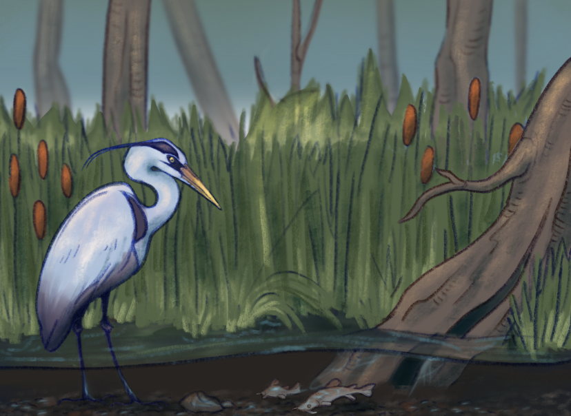
Chmura has been working in Atlantic Canada for as long as she can remember, specifically on salt marshes, a little-known natural resource that has immense consequences for endangered species conservation. Salt marshes are coastal wetlands flooded by tidal sea water. The unique daily drainage and flooding regimes of salt marshes make them a one-of-a-kind habitat for many of Canada’s rarest and most endangered plant and animal species, including the Maritime Ringlet.
One story map takes users on an interactive tour of Chaleur Bay in northern New Brunswick, the sole place on Earth known to support Ringlet butterflies. With every scroll, readers become further immersed in the wonderful world of salt marshes and the creatures that call them home.
“We proposed the idea of the story map because Environment and Climate Change Canada’s HabitatStewardship Program for species at risk is also very concerned with outreach,” Chmura said in an interview with The McGill Tribune. “Part of it was getting the public to care about salt marshes [… so they might] be interested in protecting them.”
Users are seamlessly introduced to the Ringlet, its specialized life-history traits, and how the salt marshes of New Brunswick are uniquely situated to support the species.
“Warning!” reads one frame of the story map in a cautionary tone. “To maintain this fragile species requires protection of its habitat and avoidance of activities that disturb its sensitive larval stage. Thus, walking on the marshes where it lives should be avoided.”
Story maps are a relatively new methodology for creatively displaying research findings. In the last five years, companies such as ESRI and design studios like Northwestern University’s Knight Lab have made available software packages that make it easy to create story maps on any computer.
Similar to any new digital tool, however, story maps pose their own set of challenges.
“One of the bigger struggles with these [maps] is to make them readable,” Chmura said.
Questions such as simple colour scheme and language choice are common dilemmas faced by first time story map creators, who have the task of making results engaging and understandable for a wide audience. For Chmura, this audience was primarily conservationists, but she also acknowledged that story maps have immense potential as an educational tool.
As water levels rise, marshes are moving inland and establishing new habitat spaces for species like the Maritime Ringlet, while pre-existing environments are flooded and lost. Chmura was frustrated by conservationists’ efforts to buy land that, in the near future, would be worthless for protecting these species.
“I was concerned with making sure [that conservationists] prioritized [marshes] properly,” Chmura said. “You want a marsh that has a future.”
Story maps and their distinct interactive character could be one of the most effective tools for conservation biology. At the intersection of art, digital media, geography, and conservation, the possibilities for story maps are seemingly endless, limited only by human imagination and the initiative of scientists who seek to tell a good story.