
Every two years, like clockwork, millions of people collectively spend two weeks with their eyes glued to a screen, rooting for their countries’ athletes and watching thrilling sports until our hearts, and our eyes, bleed. The Olympics have been a celebration of athletic excellence since their founding on a global scale in 1896, when Athens hosted 14 nations and 241 athletes at the first official International Olympic Committee (IOC)-run games.
Situating the Olympics historically can provide an interesting window into the past. While records and medals are often most fondly remembered, the logos of the last 51 Olympiads can tell us about design movements, historical moments, and cultural touchstones—and they are also just cool to look at.
Without further ado, here are nine of The McGill Tribune’s picks for most notable logos from the last 125 years of Olympic history.
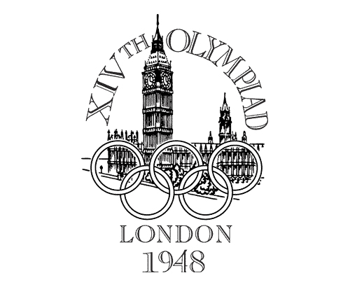
London 1948
Although the Olympics began in 1896, their early branding largely consisted of distinct fonts, coats of arms, and travel posters—rather than logos. The 1948 London Summer games featured the first real “logo,” including the iconic five rings, which symbolize the five original participating continents in the inaugural games. The depiction of the Elizabeth Tower resembles a woodblock print and the hands on the clock tower are set to four o’clock—the time of the opening ceremony, demonstrating an incredible attention to detail. The presentation of a famous British landmark was meant to symbolize the power and stability of England coming out of the Second World War.
Cortina d’Ampezzo 1956
The Olympic emblem for the 1956 Italy Winter Games was the first logo to be selected through a design competition. Italian designer Franco Rondinelli used lots of colour—a first in emblem design—while also heeding the requirements of the competition by including the Dolomite mountains and the Olympic rings. This was also the first inclusion of a stylized “snowflake” design, with many others following in the subsequent decades.
Rome 1960
The Rome 1960 logo is majestic and sombre, evoking the ancient history of its host city. Pictured are Romulus and Remus, the feuding twin brothers described in the bloody legend of the founding of Rome. They sit beneath a snarling she-wolf, who, according to legend, found the twin boys abandoned on the river Tiber and nursed them back to life. She stares at the viewer from afar, as if daring us to rise to the Olympic challenge. Of course, this emblem would not be complete without Roman numerals, which only add to its overall mythical impression: It is as if the logo were etched into an ancient stone wall. Indeed, the games themselves have gone down in history for the notable achievements of Abebe Bikila, the first East African to win a gold medal—and who did so running the marathon completely barefoot.
Tokyo 1964
The Tokyo 1964 logo, one of the most minimal designs on this list, is also one of the most aesthetically pleasing. The logo’s striking colour scheme and bold theme were imprinted on programs and posters throughout the games. The main feature, a red disc with a subtle gradient, is drawn from Japan’s iconic flag, named “Hinomaru.” The flag was only officially adopted in 1870, but its earliest origins date back to the eighth century. The red circle represents the rising sun but is distinct from the controversial Rising Sun flag associated with imperial Japan’s human rights abuses. The design itself was submitted by artist Yusaku Kamekura, whose works mixed Bauhaus influences with traditional eastern designs.
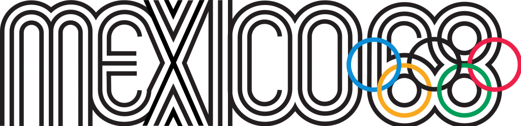
Mexico 1968
This design is a visual delight: The slim parallel lines in the font catch the eye and are exceedingly representative of the design wave of the 1960s. “It was making geometry sing,” said Lance Wyman in an interview with Global Sports Matters, the artist who designed the logo. “It was making it expressive, making it beautiful, making it strong. It had a cultural characteristic when we put it all together.” The insertion of the Olympic Rings into the “68” was not only creative and sleek, but was also prominently featured on the advertising and merchandising of the 1968 Olympics, leading to the production of visually stunning hats, stamps, and posters.
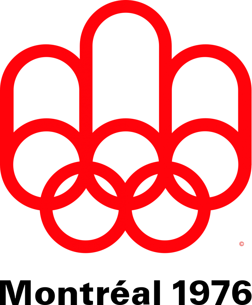
Montreal 1976
This simple, yet pleasant design holds a fond place in many Montrealers’ hearts and is still seared into the city’s core, as much of the park and recreation infrastructure built for the games remain integral parts of the city. The rings extending upwards were emblematic of the prevalent design movement at the time called “Canada Modern.” The centre oval represents the track—often seen as the central sporting event of the Olympic games—the three pillars symbolize the medal podium, and the entire design loosely resembles the Canadian maple leaf. This clean and simple design pervaded the entire aesthetic of the games, and was included on everything from the uniforms to the architecture.
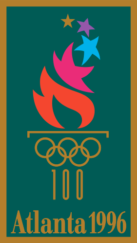
Atlanta 1996
The Atlanta 1996 logo is unique from the others on this list for its vibrant colours and the “100,” marking the Olympic games’ centennial. Designed by Michael Collins, the eye-catching multicoloured stars rising out of the Olympic torch are evocative of ‘90s graphic design trends, that favoured bold colour choices and geometric shapes. The stars also symbolize the athletes’ pursuit of excellence. The deep green background brings to mind the laurel wreaths originally worn by competitors in Ancient Greece, as well as the tree canopy featured in much of Atlanta’s urban landscape. These were exciting Games for McGill and Canada, as McGill graduates Tosha Tsang and Alison Korn won silver in the womens’ rowing eights.
Beijing 2008
The Beijing 2008 logo, entitled “Chinese Seal-Dancing Beijing,” departs from its more clean-cut predecessors with its unique, calligraphy-inspired style. The white figure in motion is etched out of the red—a colour that bears significant cultural meaning in China—and gives the emblem the look of a Chinese seal. The figure not only depicts a dancing athlete but also bears resemblance to the Chinese character “Jing” to represent the host city. That year, Montreal rejoiced as McGill student Thomas Hall won a bronze medal in the men’s 1000m canoe race.
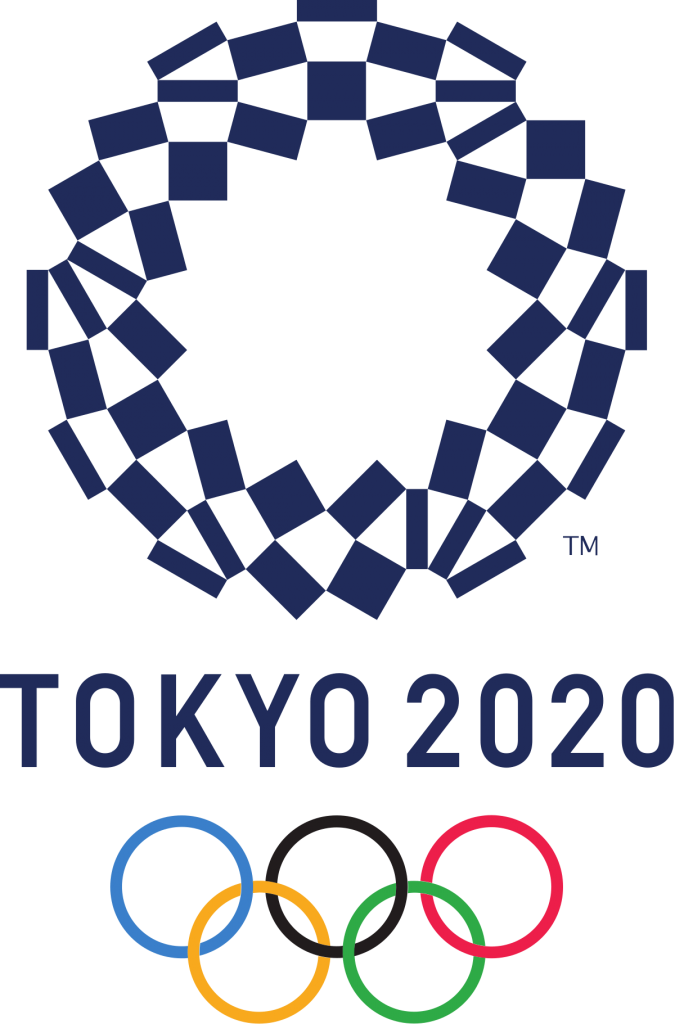
Tokyo 2020
Finally, we return to Japan for another exemplary design, this time a chequered pattern known as “ichimatsu moyo.” The design is said to symbolize prosperity due to the colour pattern continuing indefinitely. The lattice is made up of three different types of shapes to express designer Asao Tokolo’s message of strength in diversity. In addition, the indigo blue is emblematic of Japanese culture due to its use as a dye dating back to the 17th century. Though the games took place in the summer of 2021, the Tokyo 2020 banner remained since merchandise was already being mass-produced before it was postponed for a year.