

1960-61 Denver Broncos
With this uniform, the Denver Broncos made one thing clear: Sports teams should avoid brown and yellow. However, the Broncos went a step beyond the ugly colour combination by adding stripes on the pants and socks. While the pants were merely lacklustre, the striped socks may have been the worst addition to any uniform ever.
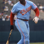
1964-76 Chicago White Sox
Few teams can pull off powder blue jerseys, and the 1971 White Sox were no exception. The light blue and bright red colour scheme was a bold choice that failed to even register in the ‘so-bad-it’s-good’ category. The worst part of the uniform was the pants: In general, teams that elect to use the same colour for their tops and bottoms do not look good, and this is doubly true when the primary colour is powder blue.
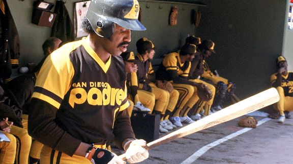
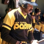
1972-84 San Diego Padres
The brown and yellow jerseys that the San Diego Padres wore from 1972-1984 are even more disappointing than their 50 consecutive seasons without a World Series title. In the otherwise-beautiful city of San Diego, the brown and yellow stuck out like a sore thumb. The Padres’ promise to return to ‘mustard and mud’ as their main colour scheme in 2020 assures that they will look as bad as they will likely perform.
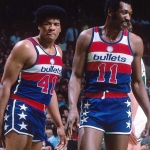
1974-87 Washington Bullets
The horizontal red and white stripes on these uniforms are terrible. However, the shorts are the true villain here. With their red waistband, white piping, and star-shaped patches, these shorts more closely resemble an American flag than an article of clothing.
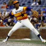
1975-1986 Houston Astros
In a long history of unique jerseys, the Astros’ white, orange, and red masterpieces are easily the most famous. Colloquially known as ‘tequila sunrise,’ these uniforms are the perfect combination of beautiful and ugly. In the last few years, they have brought back the look on several retro nights. Conspiracy theorists are still trying to prove a direct correlation between their resurgence and Houston’s recent success.
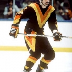
1978-85 Vancouver Canucks
In an effort to revamp their look, the Vancouver Canucks swapped their classic blue and green uniforms out for a brand new red, black, and yellow design. The jersey featured a large V-shape across the chest which, according to the designers of the uniform, stood for victory. Fortunately, they ditched the ‘V’ after seven seasons and abandoned the red, black and yellow for good in 1997.
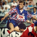
1989 Ajax away uniform
This Ajax redesign makes them look like a travelling circus. The kit’s combination of an abstract geometric pattern and a bright red and blue colour scheme is disastrous. Perhaps, the team hoped that their hideous jerseys would distract their opponents.
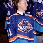
1995-98 New York Islanders
In 1995, the New York Islanders decided to change their logo from the classic ‘NY’ to a new fisherman emblem. The change led to a disaster of a jersey, which featured bright orange, teal, and black—three colours that were never meant to be in such close proximity. Islanders fans hated the logo so much that the team changed it back as soon as league rules allowed them to at the end of the 1997 season, but the colours remained until the end of 1998.
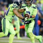
2016-present Seattle Seahawks
A uniform should be noticeable from the bleachers, but maybe not from space. The NFL-wide colour rush, in which teams wear bright, monochromatic uniforms, is an interesting concept and has produced some gorgeous uniforms. However, the Seattle Seahawks’ variation, which they wore starting in 2016, featured matching neon green jerseys and pants: An ugly and deeply unpleasant colour for a uniform.
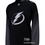
2019 Tampa Bay Lightning third uniform
The Lightning’s new alternate jersey is bland. The uniform, unveiled in early February, features only the uninspiring colours black, white, and grey. The steel-grey socks and numbering are both particularly off-putting because of how spectacularly they clash with the black. That, coupled with a lack of detailing, makes this outfit look like a practice uniform in action.
This dude is smoked out, how you gonna say those padres jerseys were bad?! that color scheme is a straight up classic… look at Ozzie and Dave Winfield looking too swagged out in these unis. Those actually one of the best units of all time and Padres back to gold and brown your predication was wrong also